Critical Essay: on (real review)
- 2024年7月18日
- 讀畢需時 8 分鐘
已更新:2025年3月26日
REAL REVIEW is a quarterly architectural-based magazine, mainly investigating contemporary culture and the complexities of modern life, all while pondering the profound question — "What it means to live today". This magazine isn't just about sharing architecture topics, but a journey of thought that explores today's complexities, providing a space for thorough thinking and deep contemplation.
Despite being positioned as a journal primarily centered around architecture and space, and with the author having an occupational background in architecture, the content of the magazine doesn't extensively delve into architectural knowledge. Instead, it invites real individuals from various fields around the world to "comment" and discuss how architectural design shapes our lives, and how the built environment influences the way people live and work today, it navigates the intricate landscape of power dynamics by meticulously dissecting the tangible facets of our environment. Their core objective revolves around the politics of space and maintaining a consistent focus on individuals' current lives and societal conditions, it covers a wide range of topics, from housing shortages to incurable pandemics, from mass surveillance systems to imminent environmental crises…
Within its pages, readers can immerse themselves in a profound journey of exploration, benefiting from comprehensive analyses that span a wide spectrum of subjects. The chief editor's architectural background not only influences the overall structure of this magazine but also imparts a shape that closely resembles architectural language to this gradually unfolding publication. Employing its distinct review format and newspaper design, which is considered an altogether new kind of magazine, experimental in form and direction, with allusions to traditions. Each issue's cover includes an iconic red-faced figure, and the staple binding mechanism makes reading ingeniously simple, akin to a pocket-sized booklet, followed by its unique presentation encapsulates a condensed yet impactful style, seamlessly weaving together a tapestry of intricate textual narratives, vibrant visual compositions, and thoughtful breathing spaces. This harmonious fusion serves a purposeful mission— to manifest as a potent conduit of knowledge and inspiration, all the while maintaining an accessible, cost-effective, and effortlessly digestible format for its avid readership.

Description:
REAL REVIEW was established in 2016, in partnership with a London-based design studio OK-RM, and the editor-in-chief of Real Review Jack Self, also known as an architect and director of REAL Foundation, a London-based cultural institute and architectural firm.
Its attractive front cover serves as an alluring gateway that catches our attention right away. The painted faces by illustrator Nishant Choksi, represent the current mood of each issue, which has become an iconic and essential component of the magazine's visual identity. The capital "R" marque situated below the face was a revival from an alphabet created by Edward Wright, who was noted for his strong engagement with architectural lettering and signage during the mid-1950s; his letter designs have become inextricably tied with the very soul of the constructed environment, while REAL REVIEW shows a deep appreciation for typographic heritage and a desire to infuse the design with meaningful connections to the past.
REAL REVIEW uses Gestalt as its main font. A well-balanced sans-serif typeface created in 2015 by typographer Seb McLauchlan from OK-RM studio. The font was designed to be clear, straightforward, simple, and legible in small sizes, making it ideal for body copy and display, particularly editorial design. Each character is expertly crafted with the goal of integrating and condensing the classic grotesque typefaces such as Helvetica, Univers, Akzidenz-Grotesk, and Folio… by maintaining a set of basic, alternate shapes while ignoring the inappropriate features and proportions from the classic fonts.
The magazine's architecture was inspired by the discovery that readers often end up folding magazines and newspapers in half, so the design team applied this reaction process to the structure, opting for quadruple-page layouts rather than the traditional double-page spreads, folded vertically to create a narrow page shape, defined as a “wide magazine disguised as a tall and thin one” (Morley,2016). It is printed on low gloss uncoated paper, which adds an aesthetic appeal and makes it easier on the eyes to improve readability. This unique selection of material and structure serves as a testament to the magazine's meticulous attention to detail, conveying a sense of practical sophistication.
Font Characteristics
Gestalt is a sans-serif typeface that balances neutrality with character, making it distinct yet highly functional. It follows a rational, Swiss-inspired structure, but with subtle nuances that soften its otherwise rigid geometry. Key features include:
• Balanced Proportions – The typeface maintains a clean and consistent rhythm, making it highly readable across different sizes.
• Open Counters – These enhance legibility and allow the text to breathe, ensuring clarity in body text as well as headlines.
• Minimal Contrast – A uniform stroke width gives it a contemporary and versatile look, suitable for both print and digital use.
• Slightly Squared Terminals – These add a subtle sharpness, distinguishing it from more generic grotesque sans-serifs.
• Humanist Touch – Unlike purely mechanical typefaces, Gestalt introduces small quirks in letterforms that make it feel more approachable and engaging.
Real Review is known for its unconventional portrait-oriented layout, where text often dominates the page. Gestalt plays a pivotal role in achieving this striking yet minimalistic aesthetic, supporting:
• Editorial Clarity – The magazine’s in-depth articles require a typeface that enhances readability while maintaining a strong typographic presence.
• Identity & Branding – Gestalt is more than just a font; it acts as a visual signature for Real Review, creating a cohesive and recognizable look.
• Design Flexibility – The typeface adapts well to various applications, from dense body text to bold headlines, reinforcing Real Review’s intellectual and experimental nature.
By combining rational structure with subtle humanist details, Gestalt aligns perfectly with Real Review’s mission—to dissect, analyze, and rethink the world around us. It is a typeface that, much like the magazine itself, is precise, critical, and deeply considered.

Interpretation:
REAL REVIEW aims to make architecture
accessible, inclusive, and enjoyable. — Jack Self, 2016
Jack Self emerges as an architect with a profound vision, that goes beyond typical architectural boundaries. He concentrates on initiatives that advance his fundamental goals, which are to promote inclusivity and democracy. While REAL REVIEW is a publication that offers insightful and thorough criticism in a way that is both addressed to initiated readers who are knowledgeable about the subject matter and those who approach it with a fresh perspective. He believes that each issue should be aimed at all reading levels: those who have no knowledge of architecture, and those who have been practising for decades (Self,2016). By smoothly bridging the knowledge gap between the known and the unfamiliar, this special combination ensures that the publication appeals to a wide range of mixed audiences, thereby cultivating a diversity of understanding and appreciation.
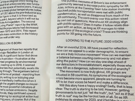
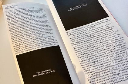
As REAL REVIEW aims to explore the present through historical study and offer insights into the future; how they included the folds and four-column layout from newspaper designs adds a layer of appropriateness and significance to this approach. The grid-based layout was influenced by the vertical structure commonly seen in newspapers, and the strategic incorporation of a four-column layout expands the possibilities for artistic expression; the optimal utilization of white space creates a composition that is both visually appealing and readable, which provides a canvas that is rich in potential and defies any preconceived restrictions, showcasing a diverse yet symmetry approach. This incorporation is more than just an aesthetic choice; it also functions as an intentional link between the eras and a symbiotic tie that evokes the freshness and inventiveness of old-fashioned publications.
Beyond the notion, the visual components of the magazine demonstrate its unwavering commitment to diversity and inclusiveness. The treatment between the line spaces and selection of font demonstrates significant concern for its legibility and readability, as well as the content and format decisions that allow readers to smoothly comprehend and engage with the message intended by the author. Plus, its careful approach to the grid demonstrates its dedication to giving readers an immersive and breathable reading experience by providing remarkable flexibility to the arrangement of content pieces and serving as a useful framework for both textual and visual elements, which convey the content's essence with utmost clarity.
Explanation:
According to 'The Crystal Goblet or Why Printing Should be Invisible,’ by Warde, B. (1955), the author argued that the role of typography is not to draw attention to its own form but to ensure that the content is easily accessible and readable for the audience. In essence, she advocated that typography should be functional and utilitarian rather than ornamental. The REAL REVIEW showcases a great instance of ‘Invisible’ typography, all contents were presented in a clear and unobtrusive manner, and text elements are used in a way that doesn't draw unnecessary attention but effortlessly complements the overall design. The font choice – Gestalt, is carefully selected to be easily readable and non-distracting, allowing users to focus on the content without being overwhelmed by the typography itself. Without a doubt, the magazine seamlessly aligns with the principles set by Warde, offering readers a platform where clarity, coherence, and readability are prioritized.
Additionally, in the work 'The Principles of the New Typography’ by J. Tschichold (2001), there's a call for using simpler, sans-serif fonts, clean lines, and geometric shapes that reflect the efficiency and modernity of today. It emphasizes legibility and arranging information in a way that guides the reader's eye smoothly, making communication effective. The REAL REVIEW front cover provides a vivid example of incorporating the functional principles of new typography design, by employing varying font sizes, weights, and placements to establish a clear visual hierarchy. By deliberately using sans-serif fonts noted for their simplicity and neatness, and by methodically arranging the typography to direct the reader's gaze in a logical and effective manner throughout the page, this deliberate layout ensures that important information is visible and easily accessible, boosting productive interactions with the audience.
While these two principles may appear distinct, their shared goal is to enhance the legibility, clarity, and overall effectiveness of visual content. Both concepts acknowledge the importance of both looks and usefulness, resulting in a comprehensive and powerful form of visual communication that strongly connects with the audience on various levels.


156 pages, softcover
11.5cm x 26cm
Published in London, 2020
Conclusion:
The REAL REVIEW has undeniably excelled in its typography and layout decisions, its design concept and execution of the magazine were influenced by a thorough grasp of both visual aesthetics and effective communication, showcasing a remarkable fusion of creativity, practicality, and attention to detail. I like how the combination of captivating photography and artwork enhances the magazine's aesthetic impact. Each imagery was strategically integrated to complement the text and elicit emotions that are consistent with the concepts of the content. Readers can fully enjoy the creative and aesthetic components while also adding depth and meaning to the textual narratives because of the layout's adequate room for these images to flourish.
The overall publication maintains a consistent visual identity by using a careful balance between fonts for each headline and body text, ensuring that information is presented clearly, improving comprehension and engagement even though it seamlessly transitions between different topics and accommodates a wide range of content. The typography demonstrates a keen awareness of modern design trends, it skillfully combines innovative type layouts while keeping a classic appeal. Whether experimenting with the format or adhering to the structure of the outlook, the magazine showcases a dynamic range that caters to its diverse readership. However, my only concern is the commitment to upholding a consistent visual identity may restrict opportunities for bolder or more experimental layout designs inside the pages, which limits creative exploration.
For designers, the REAL REVIEW is a valuable resource that reveals essential insights into successful editorial design and typography. It exemplifies how design can be a powerful tool for conveying information, stirring emotions, and captivating readers, at the meanwhile, upholds a consistent link with its brand identity, highlighting the interconnectedness of design and brand representation. By presenting these ideas, the REAL REVIEW provides an instructive guide for designers seeking to master the art of impactful visual communication through thoughtful design choices and typographic considerations.
References List:
Muraben 2016, ‘Real Review: OK-RM and Jack Self on magazine-making on and for modern life’, viewed 14 Aug 2023, <https://www.itsnicethat.com/articles/real-review-jack-self-ok-rm-18082016>
Lagerkvist 2017, ‘Real Review #3’, viewed 14 Aug 2023, <https://fontsinuse.com/uses/16733/real-review-3>
Baird 2017, ‘Real Review by OK-RM’, viewed 15 Aug 2023, <https://bpando.org/2017/09/25/hands-real-review/>
Morgan 2018, ‘Jack Self on finance and business as design parameters’, viewed 16 Aug 2023, <https://assemblepapers.com.au/2018/10/18/jack-self-scepticism-imagination/>
Zoppi 2023, ‘An interview with Seb McLauchlan’, viewed 17 Aug 2023, <https://fontstand.com/news/essays/interview-with-seb-mclauchlan/>
Leslie 2019, ‘Cover story: Real Review #8’, viewed 18 Aug 2023, <https://magculture.com/blogs/journal/real-review-8>